All blogs
Mobile App Development
Freemium Monetization: Psychology of In-App Purchases
Freemium succeeds when psychology and clear pricing guide users to upgrade—timing, honest offers, and fair billing beat manipulation.
13 min read
Freemium Monetization: Psychology of In-App Purchases
Freemium works when the free product is useful, the paid offer shows up at the right time, and the price is clear. With in-app purchase revenue at about $150 billion in 2024, small changes in prompts, pricing, and timing can shift conversion, churn, and refunds in a big way.
If I had to boil the whole article down, it’s this:
- People don’t buy just because of features. They buy when an offer matches what they want right now.
- Emotion often beats logic. Progress, streaks, speed, and fear of losing access can push spending.
- Bias shapes price perception. Free sets expectations, first prices set anchors, and instant rewards beat future promises.
- User groups react differently. Heavy spenders, occasional buyers, and non-spenders should not all see the same offer.
- Bad monetization hurts trust. Hidden renewals, fake countdowns, and pay-to-relieve-frustration loops can lift short-term sales but hurt retention.
- Good freemium design is simple. A useful free tier, clear upgrade points, plain billing terms, and easy cancellation.
- You have to measure both money and user response. Watch conversion, ARPU, ARPPU, churn, refunds, and review language after any pricing or paywall change.
A few numbers stand out:
- 1% to 5% free-to-paid conversion is common for broad consumer apps
- Top subscription apps often see $2 to $5 ARPU
- Top subscription apps often see $15 to $40 ARPPU
- In mobile games, about 5% of players drive 90% of IAP spend
- One study found 80%+ of free-to-play mobile games used dark-pattern design
The core takeaway is simple: use psychology to help users make a clear choice, not to box them in. That means showing the right offer after people see value, using plain prices like $9.99/month, stating renewal terms up front, and testing changes without harming retention.
The Main Psychological Drivers Behind In-App Purchases
Emotions That Drive Spending
Once users are engaged, emotion and bias shape whether an upgrade feels worth the money. Emotion usually hits first, and it tends to fall into two buckets: positive feelings and loss-avoidance feelings.
Positive emotions like enjoyment, pride, satisfaction, and a sense of progress can push people to spend. Research on mobile games shows that enjoyment and satisfaction increase both the chance of making an in-app purchase and long-term retention. That makes sense. When someone finishes a workout, completes a lesson, beats a level, or hits a streak milestone, they're already feeling good. A well-timed offer right after that moment, if it feels natural and not pushy, often works better than a generic pop-up.
Loss-avoidance emotions push from the other direction. FOMO, mild frustration, fear of regret, and time pressure can lead users to spend so they don't lose progress, miss a reward, or wait longer than they want. A 90-day streak, for example, makes a streak freeze much easier to sell than a broad premium pitch. People often care more about protecting something they already built than about some future upside they might get later.
Limited-time offers have to be honest. If the same countdown keeps resetting, people notice, and trust drops fast. Use a real deadline in the user's local time, such as Offer ends Aug. 21, 2026, 11:59 PM PT.
Cognitive Biases That Change Perceived Value
After emotion comes perception. A few well-known biases shape how users judge whether a purchase is worth it.
| Bias | Effect | Application |
|---|---|---|
| Zero-price effect | Users anchor to free and resist paying even for clear value | Make the free tier genuinely useful but strategically incomplete |
| Anchoring | The first price seen shapes how all other prices feel | Lead with a higher-priced plan so mid-tier options feel affordable |
| Loss aversion | Losses feel roughly twice as painful as equivalent gains | Frame upgrades as protecting what users already have, not just adding features |
| Present bias | Immediate rewards feel more valuable than future ones | Emphasize what users unlock right now, not what they will gain over months |
| Social proof | People are more comfortable paying when others do the same | Use real usage signals |
This is why immediate, loss-framed messaging tends to work so well. Protect your 90-day streak or Remove ads now lands harder than a vague promise about premium benefits.
Different User Segments Respond Differently to Offers
The same trigger won't work for every user. In mobile games, about 5% of players account for 90% of all IAP spending. If every user sees the same offer, you're leaving money on the table.
A practical way to think about this is through three groups: high-intent spenders, occasional buyers, and non-spenders.
- High-intent spenders log in often, move fast, and spend time on competitive or status-based features. They usually respond well to VIP-style perks like early content access, loyalty rewards, and exclusive bundles.
- Occasional buyers purchase now and then, often when a promotion lines up with a real milestone. They tend to respond well to starter packs in the $0.99 to $2.99 range and seasonal offers tied to actual in-app events.
- Non-spenders need a bit more nuance. Active non-paying users may engage a lot but never buy, while lapsed users usually need a value-led reactivation push before they see purchase prompts.
Segment users by recency, frequency, and spend. Someone who made three purchases in the last 30 days is in a very different headspace from someone whose last purchase was eight months ago.
sbb-itb-622dc24
How free games are designed to make money
Ethical Influence vs. Dark Patterns in Freemium Design
Knowing what nudges users to spend is only half the job. The other half is deciding where to stop.
A simple gut-check helps: would this still feel fair if users saw the full terms up front? If not, you're probably drifting from persuasion into manipulation. And that's where trouble starts: user backlash, churn, and legal heat. Ethical design can use the same behavioral cues as conversion design, but it doesn't rely on hiding the ball. Those same cues turn harmful when they blur price, rush timing, or bury renewal terms.
Common Dark Patterns in In-App Purchases
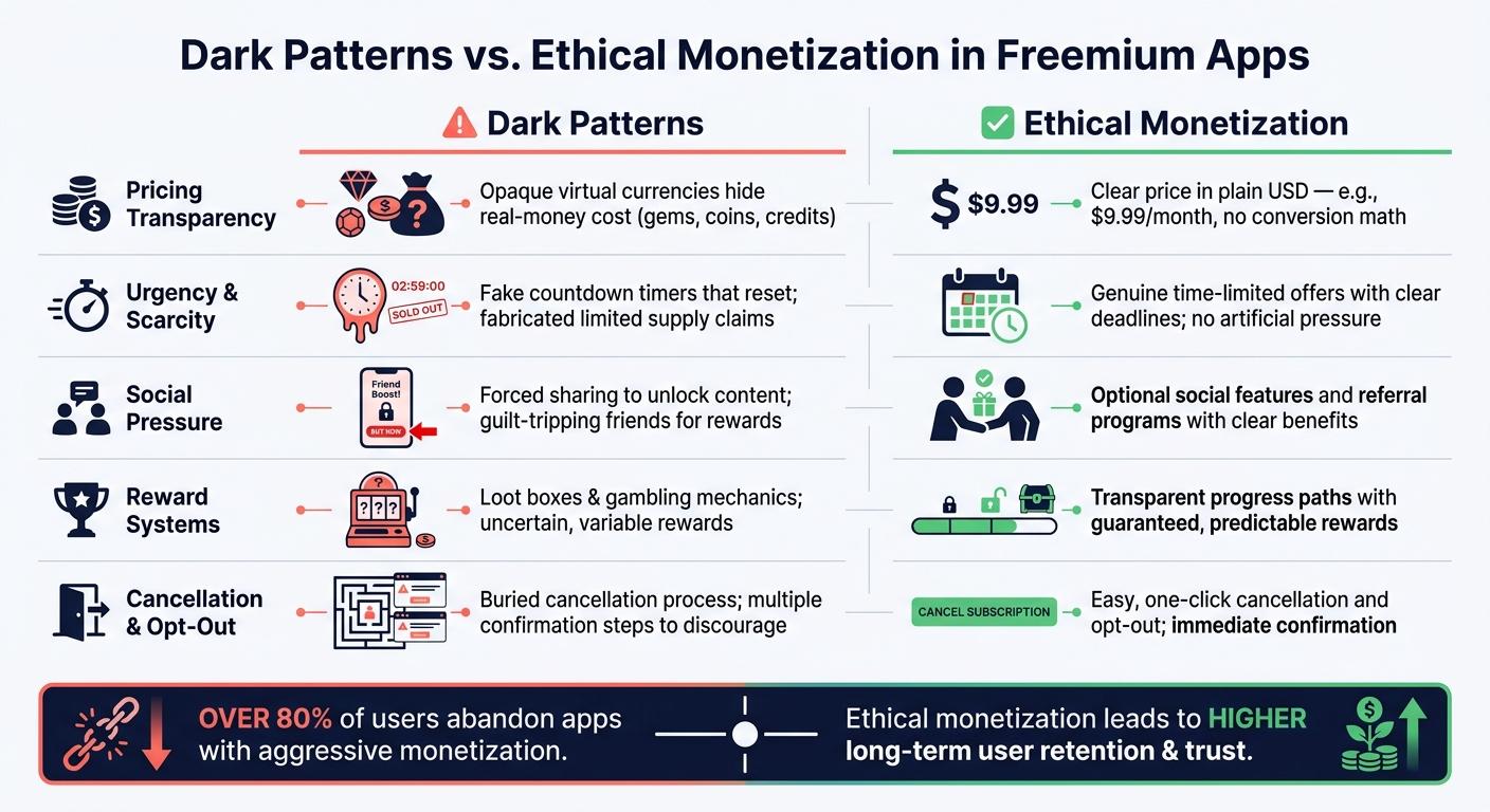
One study of mobile free-to-play games found that more than 80% included dark patterns. That's a big warning sign. The line between persuasion and manipulation usually shows up in a few familiar places.
| Pattern Type | Psychological Mechanism | Acceptable Use Case | Risk |
|---|---|---|---|
| Opaque virtual currencies | Converts real dollars into gems, coins, or credits, reducing price sensitivity | Cosmetic bundles where value is clearly shown in both the in-app currency and USD | Users lose track of actual spend, and hiding the real-money cost can be viewed as hiding material information |
| Fake urgency | Triggers loss aversion with false countdowns or "limited-time" labels | Real, one-time promotional deadlines shown clearly | Users feel pressured, and trust drops quickly when urgency is fabricated |
| Forced friction | Makes skipping or canceling feel harder than paying | Optional shortcuts that don't block core functionality | Blocking progress until payment feels punitive and often drives backlash |
| Hidden recurring charges | Relies on unclear trial language or default renewal settings | Free trials with clear auto-renewal terms | Unclear billing can lead to unauthorized charges, chargebacks, refund requests, and FTC scrutiny |
| Pay-to-relieve-frustration loops | Intentionally limits progress to leverage annoyance and relief-seeking | Optional speed-ups that don't gate the core experience | Users feel manipulated, and aggressive monetization can reduce purchase intent |
U.S. regulators are watching this area closely. The FTC's 2022 Bringing Dark Patterns to Light report pointed to designs that induce false beliefs, hide material information, and lead to unauthorized charges as practices that may be unfair or deceptive under Section 5 of the FTC Act. A few states, including California, Colorado, and Connecticut, have also written dark patterns directly into their privacy laws and banned their use for getting user consent.
That lines up with what happens at the product level. Once users feel tricked, trust drops fast. When that happens, compliance risk and churn tend to show up together.
How Aggressive Monetization Hurts Retention and Trust
Research on aggressive monetization shows a plain pattern: when users see a monetization approach as unfair, their willingness to pay drops in a meaningful way, and the odds go up that they spend nothing at all. Trust in the seller also shapes how users read pricing. Once that trust breaks, even loyal users can start treating every offer like a trap.
That means short-term conversion bumps can come at a quiet cost. You might get a few more taps today, while weakening retention and future revenue in the background.
Ethical monetization looks different in practice:
- Price is clear
- Billing frequency is clear
- Trial terms are clear
- Cancellation is easy to find and easy to complete
The free tier should still be useful on its own. Upgrade prompts should come after users have seen real value, not during onboarding when they barely know what the product does. And cancellation shouldn't feel like walking through a maze just to get out.
Those choices only hold up over time when conversion and retention stay in good shape.
How to Build a High-Converting Freemium Model Without Manipulation
Build a Free Tier That Creates Value and Upgrade Intent
The free tier is your product’s first impression. It should solve a real problem, help people build a habit, and make them want more for a clear reason - not because they got annoyed into paying.
A simple way to set this up is with a value ladder. The free version covers the main job. Premium opens up more scale, more speed, automation, or deeper personalization. For example, a productivity app might let people manage a limited number of projects for free, then charge $9.99/month for collaboration tools, automation rules, and cross-device sync.
RevenueCat suggests building the free tier around one clear job-to-be-done and shielding that experience from pushy monetization. They describe this as a “Bill of Rights” approach for the free experience.
Upgrade prompts work best at natural moments in use, like:
- when someone hits a quota
- after they finish a workflow
- when they try to use a paid feature
That timing matters more than most teams think. A fitness app that asks for an upgrade after a user tries to save a personalized training plan feels logical. An app that pushes a paywall during onboarding, before the user even gets the point, just feels like a door slammed in their face.
Once the upgrade makes sense, the next step is simple: make buying easy.
Reduce Friction in the Purchase Flow
When a user is ready to upgrade, don’t give them a reason to hesitate. A messy paywall can create doubt at the exact moment you need trust.
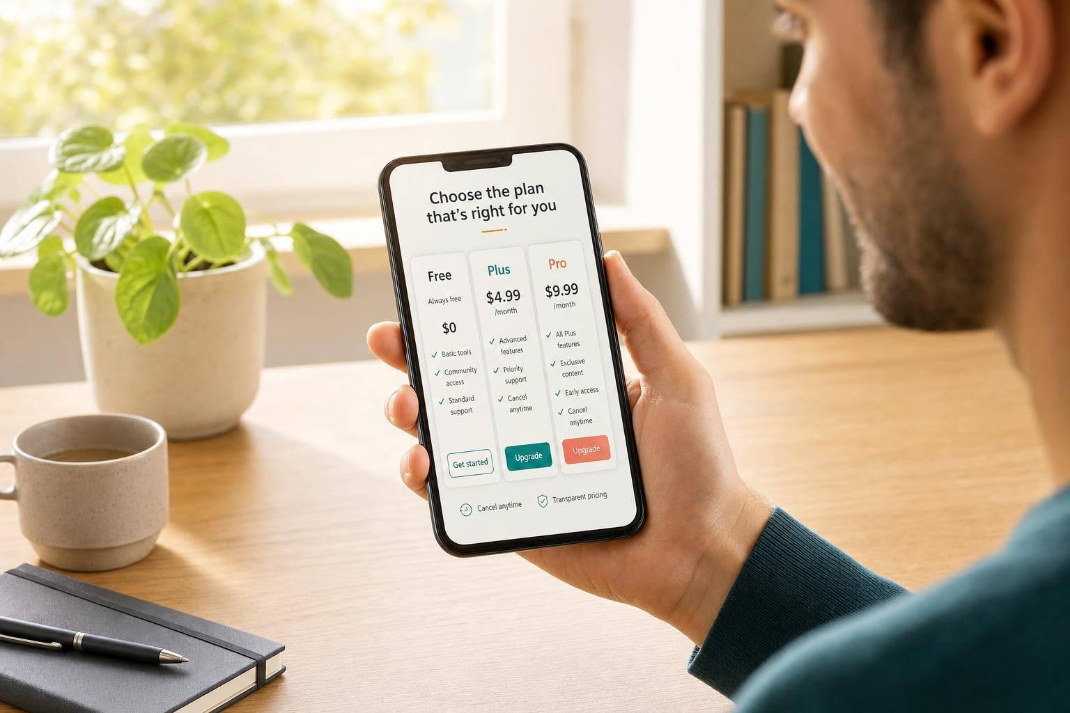
Keep the purchase screen clean. Use one main call to action. Show a clear price in U.S. dollars. Put cancellation terms on the same screen instead of hiding them behind a link. Before the user commits, they should be able to see the price, billing frequency, trial length, auto-renewal terms, and how cancellation works.
A plain monthly-versus-annual layout also helps. Show the annual plan’s per-month cost right away so people don’t have to do the math in their heads. Small trust cues can make a big difference here: a secure payment indicator, plain billing language, and no preselected add-ons. That kind of clarity cuts down the anxiety that often kills conversions at the last step.
After the flow is easy to understand, timing does most of the heavy lifting.
Use Personalization and Timing Carefully
Once the offer is clear, line it up with what the user is doing. In freemium, personalization means showing the right offer at the right point in the journey. Psychology works best when it follows behavior instead of cutting it off.
Good prompts feel connected to the action that came right before them. A design app can ask for an upgrade after a user exports several projects. An AI writing tool can suggest premium after the user hits their monthly generation cap. A travel app can surface trip-planning tools after a user builds their first itinerary. In each case, the message lands because it matches what the user just did or just ran into.
EverWash used Braze journey orchestration to present upsells after users visited a car wash several times during their first week. The company reported a 7% increase in 30-day retention and a 37% conversion rate on a holiday push campaign.
Measurement, Testing, and Key Takeaways
Metrics That Show Whether Monetization Feels Fair
Once your prompts and offers are timed well, the next step is simple: check whether they lift revenue without hurting trust. Revenue by itself can be misleading. A paywall might boost short-term sales while quietly hurting retention.
Track free-to-paid conversion, ARPU, ARPPU, retention, churn after paywall exposure, refund rate, and review tone. Top-quartile consumer subscription apps often land around $2–$5 ARPU, $15–$40 ARPPU, and under 5% monthly churn. Free-to-paid conversion usually falls in the 1% to 5% range for broad consumer apps, while higher-intent categories like fitness or productivity can push toward the top end.
Refunds and churn tell you a lot. They show whether urgency, loss aversion, or pricing came across as persuasive or manipulative. If refunds jump or billing tickets pile up, users may feel regret or confusion. And if app store reviews start using terms like tricked or bait and switch, you’ve got a fairness issue, even if the revenue chart looks strong.
These metrics should move in the same direction. If one goes up by hurting another, the model is starting to slip.
| Metric | Healthy Signal | Warning Sign |
|---|---|---|
| Free-to-paid conversion | Steady, moderate growth | Spike followed by elevated churn |
| Refund rate | Low and stable | Rising alongside new monetization changes |
| Monthly churn | <5% for mature apps | Sharp drop-off after paywall exposure |
| Review sentiment | Mentions clarity and value | Complaints about hidden fees or pressure |
How to Test Offers, Pricing, and Prompts Without Hurting User Experience
Once you’ve picked the metrics, use them to test changes one variable at a time. Pricing shouldn’t be treated like a one-and-done call. It works better as a running experiment. Apps that run paywall and pricing tests across full billing cycles can beat peers that don’t test in a big way on revenue.
Keep the test clean. Change only one thing at a time:
- price point
- trial length
- copy frame
- prompt trigger
That way, you can tell what’s doing the work. Test scarcity, framing, and timing separately so you know which lever is moving conversion.
For pricing, a practical starting point is to compare your current price with a −25% and +25% variant. For example, test $9.99 vs. $7.49 and $12.99. If you’re aiming to spot a 10% lift on a 30% trial-to-paid baseline, plan for about 2,500–3,500 users per variant.
The line between careful testing and reckless optimization is pretty clear: set stop-loss thresholds before the test starts. If a new price variant lifts conversion but pushes refund rates past a set limit, or causes a spike in billing complaints, that’s a reason to reject it. More sales don’t mean much if trust takes the hit.
Copy framing matters too. Benefit-led prompts that point to deeper health trends and personalized recommendations for $9.99/month can support positive motivation. Urgency- or scarcity-based copy can create pressure, and if you lean on it too hard, users push back. Any scarcity or limited-time claim needs to be real. US consumers notice fake countdown timers fast, and trust can drop just as fast.
Conclusion: The Best Freemium Models Use Psychology Responsibly
The core idea is straightforward: psychology works best when it increases willingness to pay without lowering trust. A free tier should solve a real problem. Upgrade prompts should appear at natural moments of intent. Pricing should be clear, in plain USD, with no hidden terms. And nudges should guide users, not corner them.
Those are the mechanics behind a freemium model that compounds over time. The good news is that this can be measured, tested, and repeated - but only when fairness is treated as a core metric right alongside revenue.
FAQs
When should I show an in-app purchase offer?
Show an in-app purchase offer at the moment it makes the most sense.
That usually means presenting it:
- right after someone hits a clear limit in the free version
- during natural pauses, like between levels or after finishing a task
- at milestone moments, when the user feels progress and momentum
The key is context. If the offer appears when people can immediately understand why it matters, it feels less like an interruption and more like a helpful next step.
Use clear visuals and empathetic messaging that spells out the upside. For example, explain that the purchase can remove limits, open up exclusive features, or make the app easier and more enjoyable to use.
How can I increase conversions without dark patterns?
Use a clear, value-first freemium setup. Set free limits at points where people naturally start wanting more, then show upgrade prompts right at that moment. The key is simple: be helpful, not pushy. If the prompt feels forced or misleading, people will notice.
Tailor those prompts to what users are doing. A person hitting a usage cap may need a different message than someone trying a locked feature for the first time. It also helps to test timing and wording. Small tweaks can change how people react.
Just as important, make the free tier smooth and worth using on its own. Onboarding should feel easy, useful, and honest from the start. Users should never get the sense that they were lured in just to hit a wall.
Which metrics matter most after changing a paywall?
Prioritize the metrics that connect straight to conversion and long-term profit:
- Paywall conversion rate and trial-to-paid rate
- Blended ARPPU or ARPU, plus how it affects CAC through ARPPU:CAC and the payback window
- Retention and churn, with extra attention on early retention
- CLV and the CLV:CAC ratio
These numbers show whether the new paywall drives more than short-term signups. They show whether it leads to revenue that lasts.
More from the studio