
All blogs
AI App Development
Explainable AI in App UX: 5 Personalization Patterns
Practical UX patterns to make app personalization explainable: reasons, source labels, editable preferences, uncertainty, and feedback.
10 min read

Explainable AI in App UX: 5 Personalization Patterns
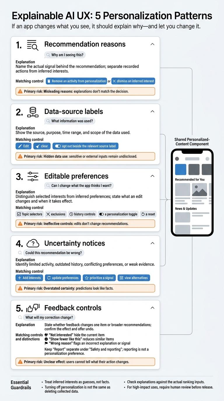
If an app changes what you see, it should explain why - and let you change it. I use five UX patterns to connect personalized recommendations with clear reasons and controls:
- Recommendation reasons: Explain why each item appears using signals the system actually used.
- Data-source labels: Show where those signals came from and how they’re used.
- Editable preferences: Let users change interests, exclude topics, or reset personalization.
- Uncertainty notices: Flag weak or outdated evidence and offer a next step.
- Feedback controls: Explain what each correction changes and let users undo it.
My rule: put the explanation and its matching action <u>beside the personalized content</u>, on mobile and web. Treat inferred interests as guesses, not facts, and make clear that turning off personalization does not delete stored data.
Before release, I check that reasons match ranking inputs, controls work as promised, and users can access them. For high-impact uses, I also require human review.
When and Where to Explain Personalization
Match explanation depth to risk. Low-stakes suggestions need one brief reason. Health, financial, employment, or safety recommendations need visible limits and a direct way to make corrections.
Use progressive disclosure: place one specific reason below the recommendation, with more details available on request.
On mobile, a “Why this?” control can open an in-place bottom sheet. On the web, use an expandable disclosure or side panel.
Don’t hide details behind hover alone. Keyboard and touch users need access, too.
In the expanded view, separate observed behavior, inferred interest, the recommendation reason, and the data-source label. An inferred interest isn’t a confirmed preference. Presenting it as one hides an assumption users may need to correct.
Show which signals were used, how recent they are, and the matching control. Topic reasons should lead to topic controls; imported data should lead to source controls. Explain whether a change affects just one item or future recommendations, then confirm the update.
Check explanations against the actual ranking inputs. Even clear wording can mislead if it names a signal the system didn’t use. Before release, ask representative users to identify the reason, distinguish evidence from inference, and predict what a correction will do. Don’t just ask whether the explanation makes them feel more confident.
Use these placement rules in the five patterns below.
sbb-itb-622dc24
1. Explain Why Items Are Recommended
User Question
Use the placement rules above to explain why each item appears.
Answer “Why am I seeing this?” with an item-specific reason in plain language, not a general explanation of personalization.
Explanation and Controls
Separate recorded actions - saved items, searches, and follows - from inferred interests, which are predictions. Name the main signal behind the recommendation, and use tentative wording when describing a prediction.
Pair the reason with a control that lets users correct the signal: remove an activity from personalization or dismiss an inferred interest.
Mobile and Web Placement
Place the reason directly under the item. Put supporting details in a mobile bottom sheet or a web disclosure.
Privacy and Accuracy Checks
Use logged features or attribution data to build explanations - not a language model’s after-the-fact rationale. Each explanation must reflect the system’s actual inputs.
Store the signal ID, type, and timestamp, and map each approved signal type to a tested template. If a language model rewrites the copy, it must not add reasons that aren't in the record.
Show only activity the account holder is authorized to see. Don't expose exact sensitive searches or another household member’s history.
Treat “I never did that” reports as possible misattribution or account-sharing issues.
Next, label the data sources behind those signals.
2. Label the Data Sources
After explaining each recommendation, show where its data comes from and how far it applies.
User Question
Where does the data come from, and how broadly does it apply? Each source label should explain what the app uses and whether it applies to this result, the current session, or account-wide personalization.
Explanation and Controls
Separate account signals, device signals, and aggregated signals from group activity. For each source, show its purpose, time range, and scope. Make clear whether account data follows the user across signed-in devices.
Place the matching edit, clear, or opt-out control beside each label, and explain when changes take effect. Turning off personalization is not the same as deleting collected data. Explain that difference.
Mobile and Web Placement
On mobile, put a compact source chip beside personalized content. Tapping it should open an expandable panel with details and controls.
On web, place labels beside recommendation modules. Link them to an account dashboard showing active sources, retention periods, and settings.
Privacy and Accuracy Checks
Aggregated data is not automatically anonymous. Set minimum group-size thresholds, hide details that could reveal private information, and link to the privacy explanation rather than promising anonymity.
Maintain an internal source inventory that records origins, transformations, and privacy limits. After pipeline changes, check that labels still reflect actual data use, including when permissions are denied or the app is offline.
Keep sensitive values out of labels and examples. Version the explanation so support and compliance teams can investigate disputes. Map each source label directly to editable preferences.
3. Let Users Edit Their Preferences
User Question
What does this app think I want, and how can I correct it? Show users’ selected interests alongside inferred preferences when possible. Let users override the system rather than relying only on what their behavior suggests.
Explanation and Controls
Once users understand why the app inferred an interest and where that signal came from, give them a direct way to change it. Offer topic selectors, exclusions, history controls, a personalization toggle, and a reset. Explain whether exclusions down-rank or block items, whether explicit choices override behavior, and when changes take effect. Confirm changes and offer undo where possible. This gives users a way to act on the explanation.
Treat resets as ranking changes, not data deletion. Topic edits should affect future rankings without suggesting that data has been deleted. Explain which inferred interests a reset clears and what stays. Make the difference between removing a signal from recommendations and deleting its record clear. Also explain what users will see with personalization turned off.
Place each control beside the recommendation or setting it changes.
Mobile and Web Placement
On mobile, ask users to pick three to five interests during onboarding, and let them skip this step. Put the full set of controls in Profile or Settings, with quick exclusions beside recommendations.
On web, keep a link to the preference center in the account menu. Include interests, exclusions, history, personalization, and resets. Add an explicit Save button when it’s unclear how changes are saved.
Privacy and Accuracy Checks
Test onboarding picks, exclusions, history deletion, the personalization toggle, and resets with both new and returning users. Measure completion, errors, and how long users take to find the controls.
Ask users to predict what each change will do, then compare recommendation logs with their expectations. Check that deleted signals aren’t reused against the stated policy, and require confirmation before deletion.
4. Show When Signals Are Uncertain
User Question
How much should I rely on this recommendation? A reason tells users why an item appeared. An uncertainty notice tells them how much to trust the evidence behind it. The aim is calibrated reliance - not blind trust.
Explanation and Controls
State the specific limitation: limited activity, outdated history, conflicting preferences, or weak evidence. Then offer a next step, such as adding interests, updating preferences, prioritizing a signal, or viewing alternatives based on different signals.
Avoid definitive predictions and confidence percentages. Show probabilities only when they’ve been validated for that use case. Put the next step beside the recommendation, not on a separate settings screen.
Mobile and Web Placement
On mobile, put a short notice below the recommendation title, with details available in a tap. On web, keep the notice inside the component and let users expand it. Don’t bury important limitations in tooltips.
For health, financial, employment, housing, or education recommendations, show the limitation before users act. Make details accessible and offer human review. Then check that the notice reflects the evidence actually used.
Privacy and Accuracy Checks
Before launch, set minimum requirements for evidence, recency, and agreement between signals. Check that each notice matches the evidence used without revealing sensitive inferences or another person’s activity. Sparse history may reflect privacy, not disinterest.
Test whether users understand the limitation and can find the next step. Compare a notice alone with a notice paired with an action. Measure corrections, dismissals, complaints, and differences across user groups. Make sure the text communicates uncertainty without relying on color alone.
Next, give users feedback controls that shape future results.
5. Give Users Feedback Controls
Once users understand a recommendation, give them a direct way to correct it. This connects the explanation to actions they can take.
User Question
Can I correct what the app recommends - and undo my choice? Users should know whether a tap changes one item or their broader profile.
Explanation and Controls
Give each control a clear job. Not interested hides the current item. Show fewer like this reduces similar items. Wrong reason flags an incorrect explanation or signal. Report sends safety or policy issues for review.
Tie each action to a specific level: item, topic, explanation, or safety review. Reporting is not a personalization preference and should not silently train the user’s recommendation profile.
Confirm each action in plain language, stating whether it affects an item, topic, creator, or profile. For example:
“Removed from your feed,”
If an action changes future rankings, explain when the change takes effect. Let users revise or undo earlier feedback.
Keep Report separate under a Safety and reporting label. Route reports for review and confirm receipt without promising removal.
Mobile and Web Placement
On mobile, put these actions in each card’s overflow menu or bottom sheet. On the web, use a visible three-dot menu or contextual button beside the item. Also place Wrong reason beside the recommendation explanation.
Provide Undo and a visible feedback history that shows the date, action, scope, and status. Let users revise individual choices or delete entries.
Privacy and Accuracy Checks
Store corrections separately from the original behavioral signal. Restrict access to report details, and don’t require sensitive disclosures. Explain whether feedback changes ranking, supports model training, or goes to human review.
Test accidental taps, shared devices, and offline submissions. Measure undo rates, repeated exposure after suppression, and whether topic frequency changes as promised. A single dismissal should not count as a permanent preference.
The next section compares these five patterns and the risks of using each one alone.
Compare the 5 Patterns and Their Risks
These patterns solve different problems - not the same problem five ways. The matrix shows which layer each pattern covers within one personalization flow: why a recommendation appears, what data shaped it, what users can change, how certain it is, and what happens after feedback.
| Pattern | User question answered | Interface control | Typical data used | Primary risk |
|---|---|---|---|---|
| Recommendation reasons | Why am I seeing this? | Expandable explanation | Recent activity, stated interests, or similar-item behavior | Misleading reasons: explanations don’t match the decision. |
| Data-source labels | What information was used? | Source label or data panel | Provided data, observed behavior, or imported data | Hidden data use: sensitive or external inputs remain undisclosed. |
| Editable preferences | Can I change what the app thinks I want? | Interest selectors or preference center | Stated interests, exclusions, or inferred preferences | Ineffective controls: edits don’t change recommendations. |
| Uncertainty notices | Could this recommendation be wrong? | Qualifier or limited-data notice | Signal quality, recency, or validated confidence | Overstated certainty: predictions look like facts. |
| Feedback controls | What will my correction change? | Correction menu with a stated effect | Explicit feedback and subsequent corrections | Unclear effect: users cannot tell what their action changes. |
Treat the five as connected layers: reasons explain, source labels disclose, preferences let users edit, uncertainty adds caveats, and feedback lets users correct. Explainability becomes useful only when disclosure, control, and correction work together.
Keep labels and control names the same on mobile and web. Change only how they’re presented.
Test each layer on its own. Compare reasons against ranking signals and source labels against the data inventory. Check that preference edits change outputs within the stated timeframe. For uncertainty notices, test whether users understand them - not just whether they notice them. A clear explanation still fails if the control does nothing.
The next section turns these risks into a build-and-test checklist.
Conclusion: Build and Test All 5 Patterns
Build one connected experience with all five patterns: plain-language reasons, visible data sources, editable preferences, calibrated uncertainty notices, and reversible feedback.
Use this release checklist for mobile and web:
- Accuracy: Trace displayed reasons to actual signals, and separate facts from inferences.
- Accessibility: Test screen readers, keyboard navigation, large text, focus order, and touch targets.
- Cold starts: Tell users when data is sparse, and collect explicit preferences.
- Stale signals: Let users clear outdated inputs.
- Shared devices: Check profile switching, sign-out, notifications, and cached pages for data leaks.
For high-impact personalization, require a human reviewer before release. They should check sources, explanation accuracy, how uncertainty is handled, disparate outcomes, override paths, and whether users can contest or correct the result. Keep override and failure logs.
Ship all five patterns together, with accuracy, accessibility, privacy, and human review verified before release.
More from the studio