All blogs
Mobile App Development
Examples of Acceptance Criteria for Mobile Apps
Concrete, testable acceptance criteria and performance targets for 12 common mobile app flows across iOS and Android.
37 min read
Examples of Acceptance Criteria for Mobile Apps
If your mobile acceptance criteria are vague, your team will guess. This article fixes that with 12 mobile app examples that turn broad requests into clear pass/fail checks for iOS and Android.
I’d sum it up like this: good mobile acceptance criteria should tell the team what success looks like, what can fail, how fast it should work, and what changes by platform. The article applies that pattern to common features like login, password reset, onboarding, profile editing, push settings, search, checkout, uploads, offline sync, cross-device performance, and AI chat.
Here’s the short version of what the article covers:
- What acceptance criteria are: story-level conditions that show when a feature is done
- What they should include: clear behavior, validation, measurable timing, device and network context, accessibility, and security
- What mobile teams need to define: screen sizes, OS behavior, permissions, offline states, interruptions, and session handling
- Which features get examples:
- Email and password login
- Social login and SSO
- Password reset
- First-time onboarding
- User profile editing
- Push notification preferences
- Search and filter
- Shopping cart and checkout
- Image and file uploads
- Offline mode and data sync
- Cross-device performance
- AI recommendations and chat
- What good criteria look like: measurable targets such as 2-second search results, 3-second checkout completion, 95% response thresholds, 10-second sync for 100 queued actions, and 99.5% crash-free sessions
- What to avoid: vague wording, implementation notes, happy-path-only stories, mixed iOS/Android behavior, and criteria that combine too many outcomes at once
A few points stand out right away:
- The article keeps pushing one idea: write outcomes, not build instructions
- It treats errors, offline use, and permission denial as first-class cases, not edge cases
- It makes performance testable with numbers like ≤2 seconds, ≤3 seconds, and P95
- It separates story acceptance criteria from the team’s general Definition of Done
If I were using this article as a working guide, I’d take one user story and make sure it answers four questions:
- What should happen when it works?
- What should happen when input or network fails?
- How fast should it respond?
- What is different on iOS and Android?
That’s the core of the piece. The rest of the article shows how to apply that same pattern across all 12 mobile app flows.
How to Write Acceptance Criteria? Explained with Real Examples
sbb-itb-622dc24
What Good Mobile Acceptance Criteria Should Include
Good acceptance criteria should be specific, measurable, testable, and focused on the outcome rather than the build method.
That last part matters more than it may seem.
For example, instead of writing "choose Google login" as a note about how the feature works, say what the user should get: "When the user chooses Google login, they are authenticated and returned to the app signed in, or shown an error message if authentication fails." That kind of wording is much easier to test. It also fits across the mobile stories that come next.
Vague criteria create confusion fast. A line like "App loads quickly" sounds fine at first, but what does "quickly" mean? Two seconds? Five? On what device? Under what network conditions? A line such as "Search results appear within 2 seconds on a supported device under normal network conditions" gives the team something clear to build and verify.
Mobile work also needs more context than desktop work in many cases. You should spell out supported devices, OS versions, network states, and what happens when the app is interrupted and then resumed. For instance, the screen should render correctly on iPhone SE and current Android phones, with no clipped text or overlapping controls. And if the user goes offline, has a weak connection, or gets interrupted, the expected behavior should still be clear. If a phone call comes in during checkout, the entered form data should still be there when the app opens again.
Accessibility and security belong in the same set of criteria too. Keep them just as concrete and observable.
For accessibility, write outcomes a tester can check, such as:
- "All interactive elements have accessible labels for VoiceOver and TalkBack."
- "Text remains usable when the system font size is increased."
For security, define the result just as plainly. Examples include clearing locally stored session tokens after logout, or asking for camera permission only when the user taps a feature such as "Scan receipt," with a clear explanation if permission is denied.
You can also include measured standards when they apply. For example, mobile text should meet a 4.5:1 minimum contrast ratio for standard text on mobile screens. That's not vague. It's a clear pass-or-fail rule.
The table below shows the difference between weak and strong criteria across common mobile areas:
| Dimension | Weak Criteria | Strong Criteria |
|---|---|---|
| Performance | "App loads quickly." | "Home screen is interactive within 3 seconds on a supported device under normal network conditions." |
| Offline | "Offline mode works." | "User can view cached content offline; a 'No internet connection' banner is shown." |
| Accessibility | "App is accessible." | "VoiceOver/TalkBack reads all interactive elements; focus is never trapped." |
| Security | "Authentication is secure." | "After logout, locally stored session tokens are cleared from the device." |
| Background behavior | "App handles interruptions." | "Form data persists if the user receives a call and returns to the app." |
1. Email and Password Login
User story: As a registered user, I want to log in with my email and password so I can access my account.
When a registered user enters valid credentials and taps "Log In," the app should sign them in and show the home screen within 2 seconds for 95% of requests on stable 4G or Wi-Fi. If the request runs longer than 10 seconds, the app should show a timeout message and let the user try again without restarting the app.
Validation needs to be clear and strict. The email field must reject invalid formats, including addresses missing @ or a valid domain. It should also trim leading and trailing spaces and show "Enter a valid email address." The password must be at least 8 characters and include uppercase letters, lowercase letters, numbers, and special characters. If either field is invalid, the app must not send the login request.
Error handling should stay generic and secure. If the user enters the wrong credentials, the app shows "Incorrect email or password" without saying whether the email exists in the system. After 5 failed attempts within 10 minutes from the same device, login is blocked for 15 minutes and the app shows "Too many attempts, please try again later." If the issue is the network, the app should show "Unable to connect. Check your internet connection and try again," along with a Retry button.
A few device and session rules matter here too. The email field should open the email keyboard on both iOS and Android. Session tokens must be stored in Keychain on iOS and Keystore on Android. Passwords must never be stored on the device. Tokens should be cleared on logout. If the session expires, the user should be sent back to the login screen with "Your session has expired. Please log in again."
| Scenario | Expected Behavior |
|---|---|
| Valid credentials, stable connection | Authenticated and on home screen within 2 seconds (P95) |
| Incorrect password | "Incorrect email or password" shown; email field preserved |
| 5+ failed attempts in 10 minutes | Login blocked for 15 minutes; generic lockout message shown |
| No network connection | "Unable to connect" message with Retry button; no credential error |
| Session expired | Redirected to login screen with expiration notice |
Use the same pattern for other login flows: define the success path, validation errors, and session rules.
2. Social Login and Single Sign-On
User story: As a user, I want to sign in with Google, Apple, or my company's SSO so I don't have to create a separate password.
Social login adds a few moving parts that standard sign-in doesn't. The app has to hand the user off to the provider, handle the redirect back, and deal with account-linking when an email already exists. If the flow works, the user should land on the right post-login screen: the home dashboard for returning users, or onboarding for new users. That should happen within the set timing targets on both iOS and Android. As a practical benchmark, the login button should show tap feedback within 200 ms, and a successful login on a stable 4G/LTE connection should usually finish in 3 to 5 seconds.
Error handling needs to cover the messy parts too. If the user cancels the provider dialog, the app should return to the login screen, avoid creating any logged-in state, and show "Sign-in canceled." If the provider denies access or the network drops during the SSO handoff, show a plain message like "Check your connection and try again" and give the user a retry option. If token validation fails on the backend, access must be denied right away and the user should see a generic auth error. And if an account already exists with the same email address, the app should ask the user to sign in with their current method first, then offer account linking afterward.
Platform rules need to be spelled out. On iOS, include Sign in with Apple whenever other third-party social logins are offered. Use the official button style, plus a system browser with OAuth 2.0 authorization code flow and PKCE. On Android, Google Sign-In should use the official SDK and follow current OAuth/OpenID Connect rules. Universal Links and App Links should bring users back to the right screen in the app instead of dumping them somewhere random.
Store tokens in Keychain on iOS and encrypted Keystore-backed storage on Android, and clear them on logout. If silent refresh fails, send the user back to login with "Your session has expired. Please log in again."
| Scenario | Expected Behavior |
|---|---|
| Successful Google/Apple sign-in | Redirected to the correct screen within timing targets; session persists |
| User cancels provider dialog | Returns to login screen; no logged-in state created; "Sign-in canceled" shown |
| Provider denies access | Clear error shown; user can try another method |
| Network failure during SSO | "Check your connection and try again" with Retry button |
| Token validation fails server-side | Access denied; generic auth error shown; failure logged internally |
| Email conflict with existing account | Prompted to use existing login method; account linking offered |
| Provider app missing | Falls back to browser auth and completes sign-in |
3. Password Reset
User story: As a user, I want to reset my password so I can regain access to my account without contacting support.
Password reset needs the same kind of clear, testable rules as sign-in. If a registered user taps Forgot password and finishes the reset flow, they should be able to log in with the new password within 1 minute of completing it.
On the request screen, the app must validate email format on the client side within 200 ms, with no server call. It also needs to show the same generic submission message for every email address, whether the account exists or not. After submission, the reset email must be triggered within 1 second and reach the inbox within 30 seconds for at least 95% of successful requests.
The reset flow must use a single-use token that expires in 15–30 minutes. If the user asks for a second reset link, every earlier token must stop working at once. On the new password screen, the app should show the password rules inline and update feedback as the user types. The password must include:
- At least 8 characters
- At least one uppercase letter
- At least one lowercase letter
- At least one number
- At least one special character
The confirm password field must match before the submit button becomes active. After a successful reset, all active sessions must be signed out. The user must also get a confirmation email saying their password was changed, but that email must not include the password itself.
Platform behavior should be spelled out just as clearly. On iOS, reset links must open the app through Universal Links. On Android, they must open through App Links. If the app isn't installed, the link must fall back to a responsive web page that lets the user finish the same flow. On Android, pressing the Back button should return the user to the previous reset step instead of closing the flow. Autofill should populate the email and new-password fields, and the email field should bring up the email-specific keyboard.
The table below turns those rules into simple pass-or-fail cases.
| Scenario | Expected Behavior |
|---|---|
| Registered email | Generic success message shown; reset email delivered within 30 seconds for at least 95% of successful requests |
| Unregistered email | Same generic message shown; no account existence revealed |
| Expired or already-used link opened | Clear explanation shown; single-tap option to request a new link |
| New password doesn't meet complexity rules | Inline, real-time feedback on which rule isn't met |
| Confirm password field doesn't match | Inline error shown before form submission |
| Repeated reset requests within 15 minutes | Requests are throttled; non-technical message shown; event logged server-side |
| Successful reset | All prior sessions invalidated; confirmation email sent; user redirected to the login screen with a success message |
4. First-Time Onboarding
User story: As a new user, I want to be guided through the app's setup so I can reach the main experience quickly and without confusion.
After auth and account recovery, onboarding adds a few things that can make or break the first session: first-run state, skip paths, and saved progress. The goal is simple. A new user opens the app, finishes or skips onboarding, and lands on the home screen without getting stuck.
Onboarding should appear only on the first launch after install or account creation. After a user completes or skips it, the flow should not appear again unless they reinstall the app or manually reset onboarding. That completion state must persist after the app is closed and reopened on both iOS and Android. The full flow should take about 60–120 seconds across 3–4 screens.
Validation needs to be just as clear as the happy path. If onboarding asks for an email address, the app must reject malformed input and show a plain inline message such as "Enter a valid email address." If the flow includes preferences, the criteria should spell out whether the user must pick at least one option, whether the step can be skipped, and whether selections remain in place when the user goes back. If a required field is empty and the user taps Next, the app must show an inline error and keep the user on that step.
Error handling is where teams often miss small but painful details. If the app saves onboarding progress to a backend and that request fails, the user must see a friendly error with a Retry option. Previously entered data must stay in place. If onboarding requests permissions like notifications, location, or camera, the requirements must state what happens when the user taps Not Now or denies access in system settings. In those cases, the app should still continue to the home screen.
Platform behavior also needs to be written in a way QA can test. On iOS, users must be able to skip onboarding and reach the main flow without dead ends. On Android, show a plain-English permission explanation before the system dialog. Android back navigation must be defined so users can move to the previous step without losing progress. On both platforms, the flow should display correctly on small and large screens, and the onboarding completion state should sync in a consistent way for the same account across devices.
The table below covers the main pass-or-fail scenarios.
| Scenario | Expected Behavior |
|---|---|
| First app launch after install | Onboarding displays automatically; user reaches home screen after completing or skipping |
| App closed mid-onboarding and reopened | Previously entered answers are preserved; user resumes from the last completed step |
| Required field left blank and Next tapped | Inline error shown; form does not advance |
| Permission denied (e.g., notifications) | App continues to the home screen; permission-dependent features remain disabled until the user enables access in settings |
| Backend save fails during onboarding | Friendly error with Retry shown; no entered data is lost |
| Second launch after onboarding completed | Onboarding does not appear; user goes directly to the home screen |
| Back button pressed on Android mid-flow | Back returns to the previous step and preserves entered answers |
5. User Profile Editing
User story: As a logged-in user, I want to update my profile information so that my details stay current without needing to use a web browser.
Once onboarding is done, profile editing helps keep account details up to date across sessions and devices. The edit screen should load with the user's current profile data already filled in, check each change before saving, and show saved updates without making the user restart the app.
Each field needs clear rules.
- Display name: required and limited to 50 characters
- Email: must use a standard email format. If the user changes it, the app should send a verification link to the new address, and the new email should not take effect until verification is complete
- Phone number: must use digits only and be 10 to 15 digits long. The app should accept standard U.S. phone number formats
- Profile photo: must be JPG or PNG and no more than 5 MB. The app must compress the image before upload
If a user enters a bad value and taps Save, the app must stop the save, mark the problem field inline, and show a plain message such as "Enter a valid email address." After validation, the behavior for save timing, upload flow, and offline recovery also needs to be clear.
On a standard 4G/LTE connection, basic profile saves should finish and refresh the profile screen within 2 seconds. For photo uploads, show a progress indicator right away, then confirm success only after the server confirms success. If a save fails because of a network issue, the form must keep all entered data and give the user a Retry option.
If the user tries to leave with unsaved changes, show a discard-or-stay dialog. Once changes are saved, updates must appear in headers, comments, and messages without a manual refresh.
For cross-platform coverage, iOS and Android must use the same validation rules, error messages, and field behavior. Behavior should match on both platforms. Testing should include at least one small-screen device, such as an iPhone SE, and one large-screen device on each platform to make sure no fields get clipped or overlap.
| Scenario | Expected Behavior |
|---|---|
| Profile screen opened while logged in | All current profile data prefilled; no blank or stale data |
| Invalid email entered and Save tapped | Save blocked; email field highlighted; inline error shown |
| Save succeeds on one device | Updated data appears on the second device after sync completes |
| Save attempted while offline | Form data preserved; error shown with Retry option |
| User navigates away with unsaved changes | Confirmation dialog shown; user can discard changes or return to save |
| Profile photo uploaded on 4G | Upload completes within 5 seconds on 4G; if it fails, the previous photo remains |
6. Push Notification Preferences
User story: As a logged-in user, I want to control which push notifications I receive so that I only get alerts that are relevant to me.
Push notification settings should feel simple and immediate. When a logged-in user changes a setting, the app should respond right away, make it clear what happened, and handle failures without trapping the user.
The settings screen should show each notification category - Order Updates, Promotions, Reminders, and Social Activity - with an on/off toggle and a short one-line description. When the user changes a toggle, the app should update the setting at once and sync it to the server within 2 seconds under normal network conditions. If the device is offline, the app should save the change locally, mark it as pending, and sync it when the connection comes back. That saved state should still be there after the app restarts and after the user signs in again.
Validation here depends on the OS permission state. If notification permission is turned off at the system level, the app should detect it, disable the related in-app toggles, and show guidance that sends the user to Settings. The app must never suggest that notifications are on when OS-level permission is off. If the server save fails, show a non-blocking error and return the toggle to its previous state.
OS-specific permission behavior also matters. On iOS, the app should respect the current authorization status and send denied users to Settings. On Android 13+, request POST_NOTIFICATIONS only at the first relevant use, not during install, and map each category to the right notification channel so users can manage them in Android system settings too.
| Scenario | Expected Behavior |
|---|---|
| User turns off Promotional alerts | Promotional pushes stop; Order Updates still deliver if enabled |
| OS-level permission denied | In-app toggles disabled; link to device Settings shown |
| Preference change on same device | Preference persists after app restart |
| Save fails due to server error | Error message shown; toggle reverts to previous state |
7. Search and Filter
User story: As a user, I want to search for items and apply filters so that I can quickly find what I'm looking for on both iOS and Android.
Search is a high-intent action on mobile. Someone types a keyword, adds filters, and expects the app to narrow things down fast. The key is simple: show only matching results, keep active filters easy to see, and make them easy to remove. Users should also be able to change or clear criteria without losing their place. As with the other flows, define what success looks like, what happens when nothing matches, and what happens when something breaks.
Be explicit about query, filter, and result logic. If a user searches for "jacket" and adds "Men's", "Blue", and "Under $100," the app should return only items that match all of those constraints. No loose matching, no surprises. Results should load within 2 seconds on a supported device under normal network conditions. If loading takes longer, show a loading indicator. For live search, use a 150-300 ms debounce. In filter modals, use a single Apply action so users can review choices before updating results.
Validation rules need to be spelled out too. The app should trim leading and trailing spaces before running a search, ignore case, and allow partial matches. It also needs to handle special characters, emoji, and whitespace-only input without breaking. Empty queries should disable Search until the user enters text. If input goes past 300 characters, cap it and show a clear message.
Empty and error states need their own pass-or-fail rules. If nothing matches, show "No results found" with a "Reset filters" action. If the network drops during search, show an error the user can retry, and keep the current query and filters in place.
Behavior should stay the same on both platforms, even if the controls look a little different. That means the same result logic, the same filter logic, and the same error handling on iOS and Android. Use native controls for each OS: follow iOS search bar patterns, use Android bottom-sheet filter overlays, and make sure the keyboard's Search key runs the query on both. Touch targets should meet platform guidance: 44 pt on iOS and 48 dp on Android for search controls, filters, and chips. Active filters should appear as removable chips above the results list, with a "Clear all" option whenever filters are active.
The table below turns those rules into pass-or-fail checks.
| Scenario | Expected Behavior |
|---|---|
| User searches "jacket" with three active filters | Only matching items shown; filters displayed as removable chips |
| Query returns zero results | "No results found" message shown with "Reset filters" action |
| Network fails during search | Retryable error shown; query and filter state preserved |
| Input exceeds 300 characters | Input capped; user notified with a clear message |
| User opens a detail page and goes back | Search query and filters restored on the results screen |
8. Shopping Cart and Checkout
User story: As a user, I want to add items to my cart, review my order, and complete checkout so that I can purchase products quickly and confidently on both iOS and Android.
Once users find the right item, checkout needs to make each cart and payment step clear. This is one of the highest-risk mobile flows, so the rules here need to leave no gray area. These criteria cover cart updates, validation, recovery, and order completion. Success means the user gets a confirmed order number after entering valid shipping and payment details.
Start with the cart. When a user taps Add to Cart, the app must add the correct product, variant, quantity, and price. The cart badge must update right away. If the user changes quantity or removes an item, the order total should recalculate in real time, without a full page reload. If an item goes out of stock before the order is submitted, the app must show a clear message and stop the user from placing the order for that item. Shipping costs, taxes, and any applied discounts must appear in the order summary before the user reaches the payment screen.
Validation and error handling need direct pass-or-fail rules. Required fields include shipping address, email, phone number, payment method, and billing information. The app should reject invalid ZIP codes, expired cards, unsupported card types, and missing address fields. Each issue should show as an inline, field-level error that tells the user what failed and what to fix. If payment authorization fails, the user must stay on the checkout screen, see a clear error, and be able to try another payment method without entering shipping details again.
Speed matters here. Cart updates should appear within 1–2 seconds, and shipping or tax recalculations should refresh before order submission. From tapping Place Order to seeing the confirmation screen, checkout submission should finish within 3 seconds on a supported device and connection. If it takes longer than 3 seconds, show a loading indicator.
Platform behavior should be specific enough for iOS and Android QA to test without guessing. The flow must work the same way on current supported versions of both iOS and Android, across common device sizes. Use Apple Pay on iOS and Google Pay on Android where supported. Numeric fields, such as card number and ZIP code, should open the number keyboard automatically. Payment entry must use a secure, PCI-compliant flow, and raw card data must not be stored on the device.
| Scenario | Expected Behavior |
|---|---|
| User taps Add to Cart | Correct item, variant, quantity, and price are added; cart badge updates immediately |
| Item goes out of stock before order is placed | Clear message shown; order blocked for unavailable item |
| User applies a valid promo code | Discount reflected in order summary immediately |
| Payment authorization fails | User stays on checkout; error shown; shipping details preserved |
| Network drops during checkout | Retryable error prompt shown; all entered data preserved |
| User taps Place Order with valid inputs | Confirmation screen shown within 3 seconds; receipt email sent |
9. Image and File Uploads
User story: As a user, I want to select and upload images or files from my device so that I can attach content to my profile, posts, or submissions on both iOS and Android.
This flow has three clear outcomes: pick, upload, and confirm.
The user opens a picker, chooses a supported file, sees upload progress, and then gets a success state. Once the upload finishes, the item should show up in the app right away. No manual refresh.
Be explicit about every entry point:
- Camera
- Photo library
- Files
- In-app document picker
That matters because iOS and Android handle permissions and file selectors in different ways.
Each upload story should use the same pass/fail setup. That means checking:
- File type
- File size
- Progress state
- Retry behavior
- Recovery after failure
The app should accept JPG, PNG, and PDF files up to 10 MB. If the user picks an unsupported format, show an inline error before the upload starts. Images should be auto-compressed before upload. Documents should keep their original quality. Only PDF is allowed for documents. Do not accept DOCX unless the story says so.
Error handling needs to cover the failures users hit most often: unsupported file type, file over the size limit, no network connection, upload timeout, server error, and permission denied. The user must be able to retry without picking the file again. Each error should say what went wrong and what to do next in plain language, such as "File must be under 10 MB" or "Upload failed. Try again." Uploads must continue or resume after the app is minimized or interrupted.
Performance matters here too. The progress indicator should appear within 1 second of tapping Upload, and the app should stay responsive while the file is transferring. Small files under 5 MB should upload in a few seconds on a standard 4G or 5G connection.
The scenarios below turn those rules into simple pass-or-fail checks.
| Scenario | Expected Behavior |
|---|---|
| User selects a supported file under 10 MB | Progress bar appears within 1 second; success confirmation is shown; preview or file name is visible immediately |
| User selects an unsupported file type | Inline error is shown before upload starts; form is not submitted |
| File exceeds the 10 MB size limit | Clear error message is shown; upload is blocked |
| Network drops during upload | Retryable error prompt is shown; user can retry without reselecting the file |
| User denies camera, photo library, or Files access permission | App shows a permission error and stops the upload |
| Upload completes successfully | File name, preview, and success status are visible; file persists after navigating away and returning |
10. Offline Mode and Data Sync
User story: As a user, I want to keep using the app when I lose my connection so that I can view my data, make changes, and have everything sync automatically when I'm back online - on both iOS and Android.
This section builds on the earlier error-handling patterns and spells out what the app should do when the network drops.
The main goal is simple: users should still be able to use key parts of the app without a connection, and anything they change should be stored safely and synced later with no data loss or duplicate records.
Focus the rules on state changes, not just the offline moment. The app should handle three states: offline, reconnecting, and synced.
When the user is offline, the app should show cached data and a clear offline indicator. It should not crash, freeze, or sit there loading forever. Any action that needs a live connection should be disabled and explained in plain language, instead of failing with no warning.
When the connection comes back, sync should start automatically. On stable Wi-Fi or LTE, the app should finish syncing up to 100 queued actions within 10 seconds.
Validation should happen in two places:
- Run client-side validation on the device before data is queued.
- Run server-side checks during sync.
If a queued record fails server-side validation, the app should mark that record with an error state and show a message such as, "Couldn't save this item to the server: [reason]." If sync fails, the app should retry 3 times over 30 seconds, then show a non-blocking banner while keeping all queued data safe.
Conflict handling needs to be spelled out. For most content, last write wins by timestamp is acceptable. For financial data or bookings, the server should be authoritative. Either way, the criteria should state exactly how conflicts are settled and what the user sees after the conflict is resolved.
| Scenario | Expected Behavior |
|---|---|
| User goes offline and creates new records | Records are saved locally, queued for sync, and the app shows a "Saved locally" status |
| Connection returns after an offline session | Sync starts automatically and queued changes appear on the server within 10 seconds |
| Same record is edited on two devices | The conflict is resolved according to the defined policy, and the user is notified |
| Sync fails after 3 retries | A non-blocking banner is shown, queued data is preserved, and no data is lost |
| App is opened for the first time with no connection | The app shows the offline state clearly, does not crash, and cached content is accessible if available |
Background sync also needs platform-specific rules. On iOS, sync should run in the foreground and in the background when the system allows it, without blocking the user's actions. On Android, schedule sync with WorkManager so it can resume after Doze or app standby.
Test this on real devices, not just simulators. Use throttled networks or airplane mode to make sure the app behaves the way people expect when the connection gets spotty or disappears altogether.
11. Cross-Device Performance
User story: As a user, I want the app to work smoothly and render correctly on iPhone and Android devices so I can complete tasks without slowdowns, crashes, or broken layouts.
Cross-device performance matters because mobile apps need to stay stable across many device models, screen sizes, and OS versions. That’s especially true for stories with heavy rendering, network calls, or lots of state changes.
Start with a 15–20 device/OS matrix based on real usage data. Pull it from Google Play Console or App Store Connect so the matrix matches how people actually use the app.
Then use that matrix to define pass/fail limits for launch, scrolling, loading, memory, and stability:
- Cold start: ≤3 seconds on mid-range devices, ≤5 seconds on minimum-spec devices
- Screen transitions and data loading: ≤2 seconds for cached content, ≤3 seconds for fresh data on 4G or Wi-Fi
- Touch interactions: respond within 100–200 ms; scrolling maintains at least 50 FPS
- Memory usage: ≤300 MB RAM during normal browsing on mid-range devices
- Stability: ≥99.5% crash-free sessions across supported devices; no device-specific crash cluster above the defined threshold
Error handling should follow the same acceptance-criteria pattern used throughout this article: clear trigger, clear response, clear recovery. A blank screen tells the user nothing. If a screen doesn’t load within 5 seconds on a low-end Android device, show a retry option and placeholder content instead. If the app detects an unsupported OS version, show "This app requires iOS 15 or later" rather than failing silently.
The scenarios below turn those limits into outcomes you can test.
| Scenario | Expected Behavior |
|---|---|
| Cold start on a mid-range Android device | Home screen appears within 3 seconds; loading indicator shown if content takes >500 ms |
| Scrolling a product list on an older iPhone | Smooth scroll at ≥50 FPS; no dropped frames or jank |
| App opened on an unsupported OS version | Clear in-app message displayed; no crash or silent failure |
| Low-memory warning triggered on Android | App degrades gracefully (e.g., reduces animations); no crash or data loss |
| Layout rendered on a large tablet screen | No clipping, overlap, or broken UI elements in portrait or landscape mode |
Use Xcode Instruments for iOS and Android Studio Profiler for Android to measure startup time, frame rate, CPU, memory, and network usage against these thresholds. On AI-heavy screens, those same latency and memory limits matter even more.
12. AI Recommendations and Chat
User story: As a user, I want the app to show me relevant recommendations and let me ask questions through AI chat so I can find what I need quickly without empty states or unclear failures.
Just like the other mobile flows, AI needs clear acceptance criteria around success, fallback behavior, speed, and platform parity. The point is simple: define what the user sees, how fast it shows up, and what happens when the model doesn’t deliver.
For recommendations, a direct, testable rule could be: if I’m logged in and open the home screen, I should see at least 10 personalized suggestions within 2 seconds on a 4G connection. If I don’t have any history yet, the app should show a curated default or category-based fallback instead of an empty state. If recommendations time out, the app should return a fallback list. If the data is malformed, it should fall back to category items. After a favorite or purchase, results should refresh within 5 seconds.
There’s also a quality check here. Recommendations shouldn’t keep cycling the same narrow set of items again and again. And if the app tells the user why something was recommended, that explanation should stay short and match across both platforms.
For AI chat, define both the happy path and the fallback path. If confidence drops below 0.7, the bot should ask a clarifying question and show three quick replies, such as Track an order, Return an item, and Talk to an agent. If content is unsafe or blocked, the app should return a neutral message and route the user to support. If the chat service is temporarily unavailable, the app should say so plainly and offer a retry option.
The handoff to a human needs its own rule too. When a user taps Talk to an agent, the handoff should finish within 10 seconds, and the AI should stop responding in that session. Chat history should persist if the app is closed and reopened within 5 minutes. After that, a new session should begin with a clear notice.
Keep all performance thresholds in one place so nobody has to hunt for them later:
- AI chat replies render within 3 seconds for 95% of requests under normal load
- Recommendation availability stays at 99.5% over 30 days
- At least 80% of top-five intent chats - order status, returns, shipping, account help, and general info - end without human escalation
The table below turns those rules into direct pass-or-fail checks.
| Scenario | Expected Behavior |
|---|---|
| User has no interaction history | App displays a curated default or category-based fallback instead of a blank screen |
| Recommendation API times out (>3 seconds) | App shows a non-blocking fallback and popular items while it reconnects |
| AI chat confidence score below 0.7 | Bot asks a clarifying question and displays three quick-reply options |
| User taps "Talk to an agent" | Handoff completes within 10 seconds; AI stops responding in that session |
| App closed and reopened within 5 minutes | Previous chat history is restored; a new session starts after 5 minutes with a clear notice |
| Same user account opened on iOS and Android | Recommendation results stay functionally equivalent across iOS and Android for the same account and input state |
Use the same prompt, response schema, and fallback rules on both platforms.
How to Write Acceptance Criteria for Mobile User Stories
Use two formats: rule-based bullet lists and Given/When/Then scenarios. Both fit the login, onboarding, checkout, upload, offline, and AI stories in this article.
Rule-based bullets are best for validations, UI limits, and performance thresholds. Each line should be atomic and easy to test. For example: "Search results appear in under 2 seconds on a stable 4G/5G connection" or "The Continue button stays disabled until both fields contain valid input."
Given/When/Then is a better fit when behavior changes based on user state or a step-by-step flow. The pattern is simple: Given the context, When the user takes an action, Then the app responds. For example: "Given the user is signed out, when they tap 'Log in with Google,' then they are redirected to Google authentication and returned to the app upon success."
Be specific. Use measurable thresholds instead of fuzzy wording. And tie performance to a network condition - stable Wi-Fi, 4G, or 5G - because mobile results change with connection quality. "The form displays an inline error within 1 second of an invalid submission" can be tested. "The app should load quickly" can’t.
Start with the happy path. Then layer in errors, permissions, offline states, and app interruptions. That order keeps the core flow clear before you deal with what happens when things go sideways.
| Format | Best Used For | Example |
|---|---|---|
| Rule-based bullets | Validations, UI rules, performance limits | "Upload completes within 10 seconds on Wi-Fi for files up to 10 MB" |
| Given/When/Then | User flows, state-dependent behavior, edge cases | "Given the app is offline, when the user submits a form, then the data is queued and synced when connectivity returns" |
| Combined (both) | Complex features with rules and flow logic | Use both when a feature needs rules and flow logic. |
Use these formats to tighten the mobile examples above before reviewing common mistakes.
Common Mistakes to Avoid
A few mistakes show up again and again in mobile acceptance criteria, and they tend to make QA work harder than it should.
Vague criteria are a big one. Phrases like "load fast" or "feel smooth" sound fine at first, but they can't be tested. You need a measurable result instead, like: "The home screen loads in under 2.0 seconds on 4G for 95% of test runs." If QA has to come back with follow-up questions, the criterion isn't ready.
Another common problem is putting implementation details into acceptance criteria. That locks the story to one way of building it. The better move is to describe behavior: sign-in succeeds, the user reaches the home screen, and the session stays active until logout or expiry. The how belongs in technical design docs, not in the user story.
Then there's skipping negative paths. That's where a lot of production bugs slip through. If your criteria only cover the happy path, you're leaving out the moments when things go wrong. Write separate criteria for declined payments, expired sessions, and denied permissions.
It's also easy to miss platform differences between iOS and Android. But those differences matter. Permissions and navigation don't work the same way on both platforms, so your criteria shouldn't pretend they do. Write separate criteria for each OS when behavior changes.
One more issue: bundling several outcomes into one criterion. That's a recipe for confusion. Search speed, result display, and error handling should be split into separate criteria. Each one should stand on its own with a clear pass/fail result.
Use the table below as a quick check before moving to the reference table.
| Mistake | Why It's a Problem | Better Approach |
|---|---|---|
| App should load quickly | Not testable | Home screen loads in under 2.0 seconds on 4G |
| Describe how login is implemented | Ties criteria to one implementation | Describe the user's experience and session behavior instead |
| Happy-path criteria only | Misses failure cases | Add criteria for declined payments, expired sessions, denied permissions |
| One criterion for both iOS and Android | OS behaviors differ significantly | Write platform-specific criteria for permissions and navigation |
| Multi-outcome criteria | Not atomic | Split into one criterion per outcome |
Acceptance Criteria Reference Table
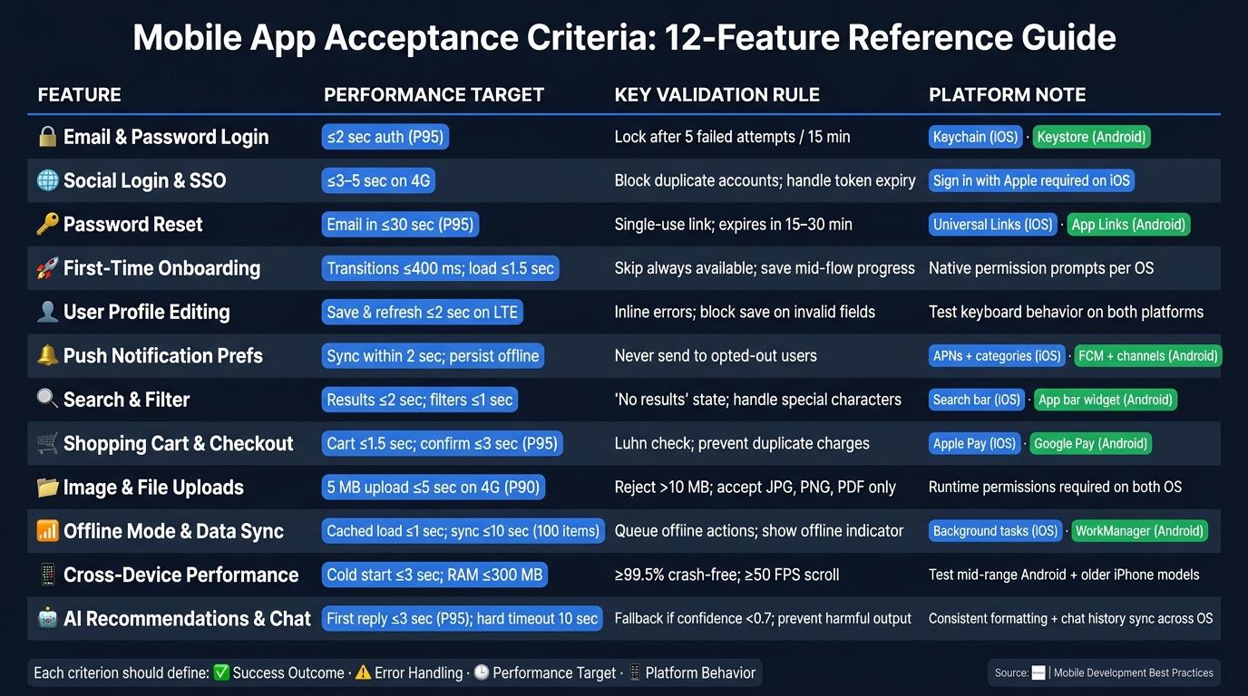
This table boils 12 examples down to the four checks teams lean on most: user outcome, validation, performance, and platform rules. It gives you a side-by-side view of how those checks show up across the 12 examples above.
| Feature | Expected User Outcome | Validation & Error Handling | Performance Target | Cross-Platform Considerations |
|---|---|---|---|---|
| Email and Password Login | User logs in with a valid email and password and lands on the home screen within 2 seconds on a 4G connection. | Reject invalid email format; enforce 8-character minimum password; lock account for 15 minutes after 5 failed attempts. | Authentication API responds in ≤2 seconds for 95% of requests. | Consistent error messaging on iOS and Android. |
| Social Login and Single Sign-On | User signs in with an existing account (Google, Apple) and reaches the home screen without re-entering credentials. | Handle token expiry gracefully; show a clear error if the provider is unavailable; prevent duplicate accounts from the same identity. | SSO redirect and session creation complete in ≤3 seconds. | iOS: include Sign in with Apple when other social logins are offered; Android: use Google Sign-In and follow Material Design button styles. |
| Password Reset | User receives a single-use reset link, sets a new password, and can log in immediately after. | Link expires in 15–30 minutes and can only be used once; new password must be at least 8 characters and include uppercase, lowercase, a number, and a special character; show a generic confirmation even for unregistered emails. | Reset email delivered within 30 seconds for 95% of successful requests; new password saves in ≤2 seconds. | Same outcome on both platforms; test deep link handling on iOS and Android. |
| First-Time Onboarding | User completes setup and reaches the main screen. | Skip option always available; progress saved if the user exits mid-flow; required permissions explained before prompting. | Screen transitions complete in ≤400 ms; onboarding sequence loads in ≤1.5 seconds. | Use platform-native permission prompts; iOS requires explicit permission dialogs; Android runtime permissions vary by OS version. |
| User Profile Editing | User updates their profile and sees changes reflected immediately after saving. | Validate required fields (display name, email, phone number, profile photo); reject invalid email formats; show inline errors; block save until all required fields are valid. | Profile saves and refreshes in ≤2 seconds on LTE. | Consistent field layout on iOS and Android; test keyboard behavior and input types on both platforms. |
| Push Notification Preferences | User toggles notification categories and changes take effect immediately. | Handle OS-level permission denial gracefully; guide users to system settings if blocked; never send notifications to opted-out users. | Toggle changes sync within 2 seconds under normal network conditions and persist offline. | iOS: APNs + notification categories; Android: FCM + notification channels. |
| Search and Filter | User finds relevant results quickly using keywords or filters. | Show a "No results found" state with suggestions; handle special characters; clear-filters button always functional. | Results display in ≤2 seconds for supported devices under normal network conditions; filters apply in ≤1 second with no UI freeze longer than 200 ms. | iOS: search bar in navigation bar; Android: search widget in app bar; consistent behavior across both. |
| Shopping Cart and Checkout | User reviews items, pays, and receives a confirmation with no duplicate charge on retry. | Validate card number (Luhn algorithm), CVV, expiration date (MM/YY), and ZIP code; show clear inline errors; prevent duplicate charges on retry. | Cart loads in ≤1.5 seconds for up to 50 items; confirmation screen appears within 3 seconds for 95% of transactions. | Support Apple Pay on iOS and Google Pay on Android; consistent checkout UI across platforms. |
| Image and File Uploads | User selects and uploads a photo or file with visible progress feedback. | Reject files over 10 MB; accept JPG, PNG, PDF; show a "File too large" or "Unsupported format" error; progress indicator updates at least once per second. | A 5 MB image uploads in ≤5 seconds on a standard 4G connection for 90% of attempts. | iOS and Android: runtime permissions required; support multiple gallery apps and document providers on Android. |
| Offline Mode and Data Sync | User views cached content and queued actions sync automatically when reconnected. | Show an offline indicator; block actions requiring live connectivity; queue offline actions and mark them as pending or failed; prompt user to resolve conflicts. | Cached content loads in ≤1 second offline; sync completes in ≤10 seconds for up to 100 pending items on LTE. | iOS: use background tasks for sync; Android: use WorkManager; consistent conflict resolution rules and timestamps across both OS versions. |
| Cross-Device Performance | App feels responsive on both entry-level and flagship devices across iOS and Android. | No ANR rate above 0.47% of daily active sessions; crash-free sessions above 99.5%; frame rendering stays at 60 FPS with less than 1% dropped frames. | Cold start ≤3 seconds on mid-range devices; screen transitions ≤2 seconds for cached content; memory usage ≤300 MB RAM during normal browsing. | Test on representative mid-range Android and older iPhone models; validate landscape mode and split-screen on tablets. |
| AI Recommendations and Chat | User receives relevant suggestions or chat responses and can accept, dismiss, or refine them. | Handle timeouts with a friendly fallback message; prevent harmful outputs; allow users to report problematic responses; log errors for monitoring. | First AI response in ≤3 seconds for 95% of requests; hard timeout at 8–10 seconds with a retry option; subsequent turns respond in ≤2 seconds. | Consistent response formatting on iOS and Android; sync chat history across devices for signed-in users. |
When a story needs step-by-step behavior, the scenario format below works well. It turns broad rules into something teams can test without guessing.
| User Story | Rule-Based Criteria | Given/When/Then Scenario |
|---|---|---|
| Password Reset - As a registered user, I want to reset my password via email so I can regain access if I forget it. | Reset link expires in 15–30 minutes. Link is single-use only. New password must be at least 8 characters and include uppercase, lowercase, a number, and a special character. Show a generic confirmation even if the email isn't registered. | Given the user has an active account at user@example.com And requests a password reset, When they click the single-use reset link within 15–30 minutes and enter a valid new password, Then the password updates and the reset link cannot be reused. |
| Shopping Cart and Checkout - As a shopper, I want to complete my purchase so I receive my order. | Validate card number (Luhn), CVV, expiration (MM/YY), and ZIP code. Show inline errors for invalid payment details. Prevent duplicate charges on retry. | Given the user has items in their cart And enters valid payment details, When they tap "Place Order", Then a confirmation screen appears within 3 seconds, a receipt is sent to their email, and no duplicate charge is applied on retry. |
| Offline Mode and Data Sync - As a user, I want to access my content without an internet connection so I'm not blocked when offline. | App must display recently cached content without connectivity. Offline actions must be queued and synced on reconnection. Show an offline indicator at all times when disconnected. | Given the device has no network connection, When the user opens a previously viewed screen, Then the content displays from cache with an "Offline" badge, and any edits are queued and synced automatically when connectivity is restored. |
Conclusion
Clear acceptance criteria cut rework, speed up testing, and make releases more predictable.
The 12 examples in this article focus on the mobile app flows that matter most: authentication, onboarding, checkout, offline access, and AI-driven features. They’re not meant to be copied line by line. Think of them as starting points, then shape each one around your app’s business rules and the needs of each platform. Once you’ve done that, apply the pattern to one user story at a time.
A simple way to start is to pick one high-impact story and write criteria for:
- success
- errors
- performance
- iOS and Android behavior
Start with the user outcome. Then move to testable validation rules. After that, spell out any platform-specific behavior. That gives QA a clear checklist and gives the team a shared definition of done.
FAQs
How do I write acceptance criteria for a new mobile feature?
Start by working with a tester, developer, and product owner so the acceptance criteria are clear, testable, and tied to what the user wants to get done.
The user story should be Independent, Negotiable, Valuable, Estimable, Small, and Testable. Spell out the success metrics, explain the feature from the user’s point of view, show how it should work, call out technical requirements, and include accessibility needs based on WCAG.
What metrics should mobile acceptance criteria include?
Mobile acceptance criteria should include measurable performance and usability metrics. That way, you can check whether the app is doing what it’s supposed to do instead of relying on gut feel.
Key metrics often include:
- Loading times under 3 seconds
- Stability with no crashes
- Task completion rates
- Time on task
- Error rates, such as misclicks
- User satisfaction scores like the System Usability Scale or Net Promoter Score
These metrics give teams a clear way to judge whether the app is ready and whether people can use it without friction.
When should iOS and Android criteria be separated?
Separate iOS and Android acceptance criteria when each platform needs its own behavior, UI pattern, or technical setup.
This matters most when the apps rely on different native tools, like VoiceOver on iOS and TalkBack on Android, follow different platform conventions, or are built natively with Swift or Kotlin.
More from the studio